
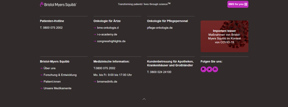
Universal Navigation with Collapsed and Expand Logo
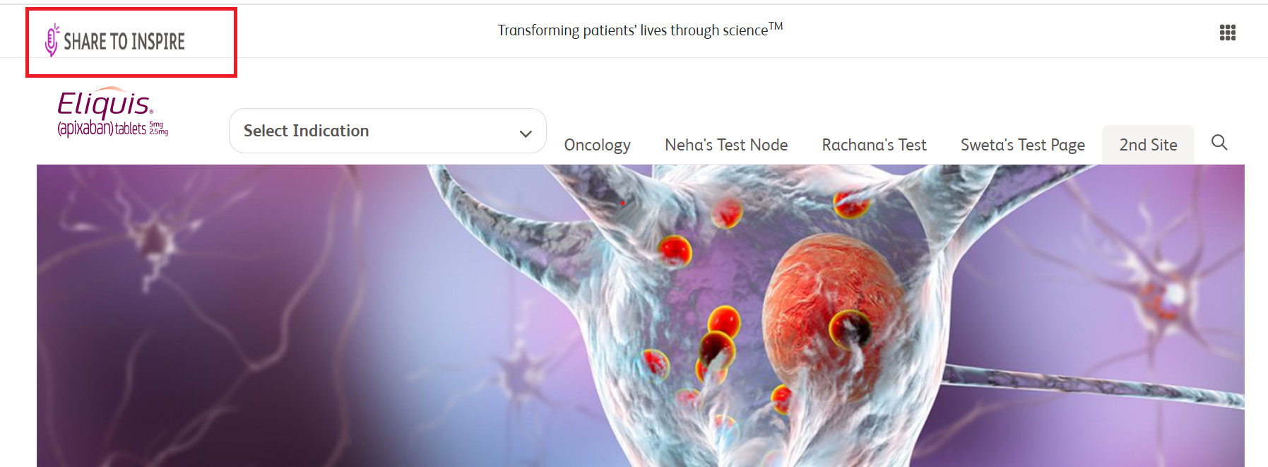
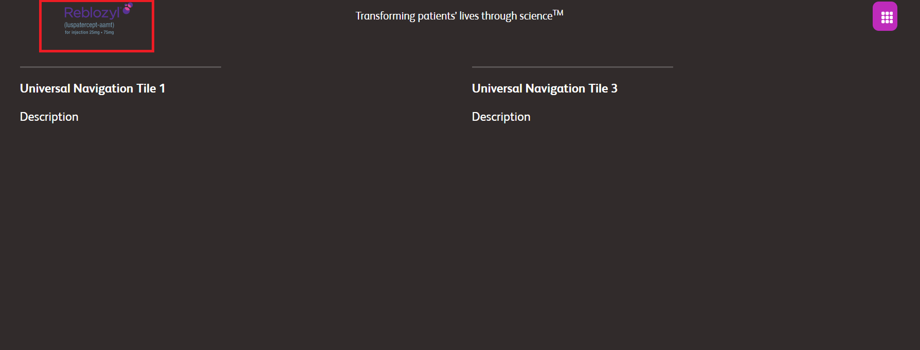
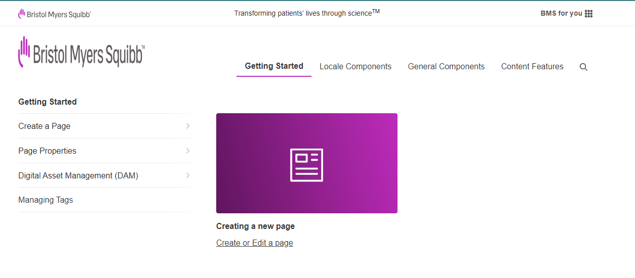
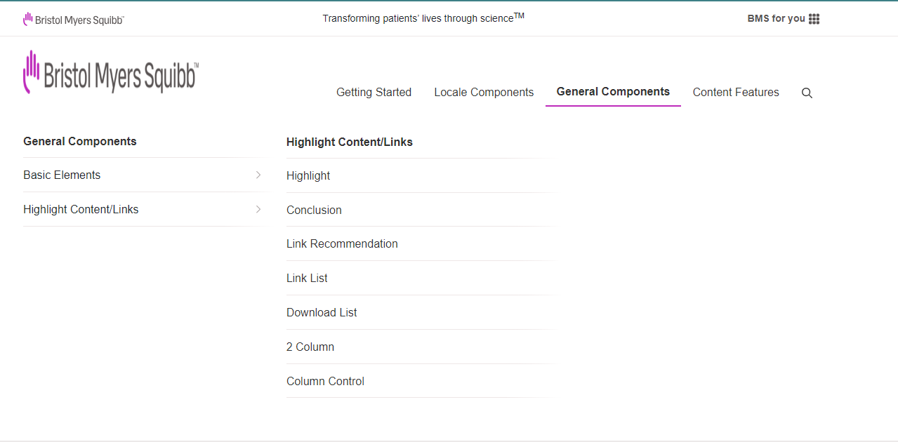
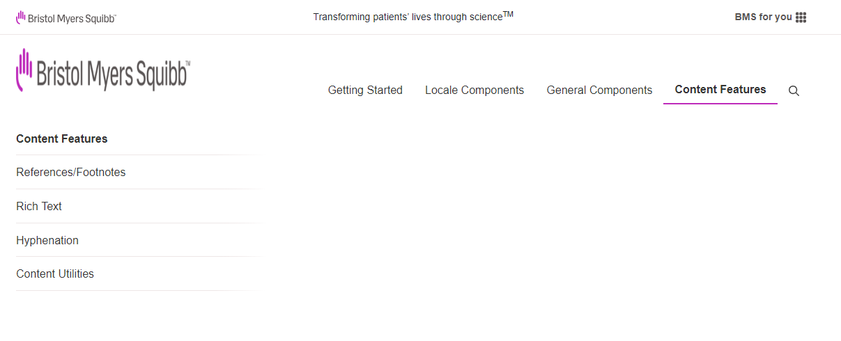
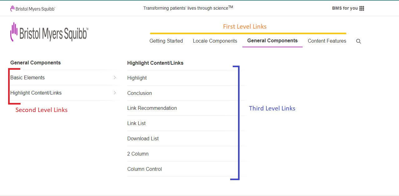
Main Navigation - Flat variation
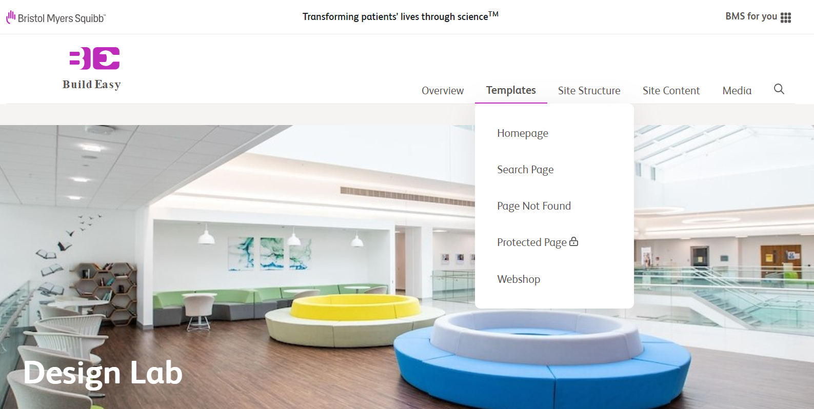
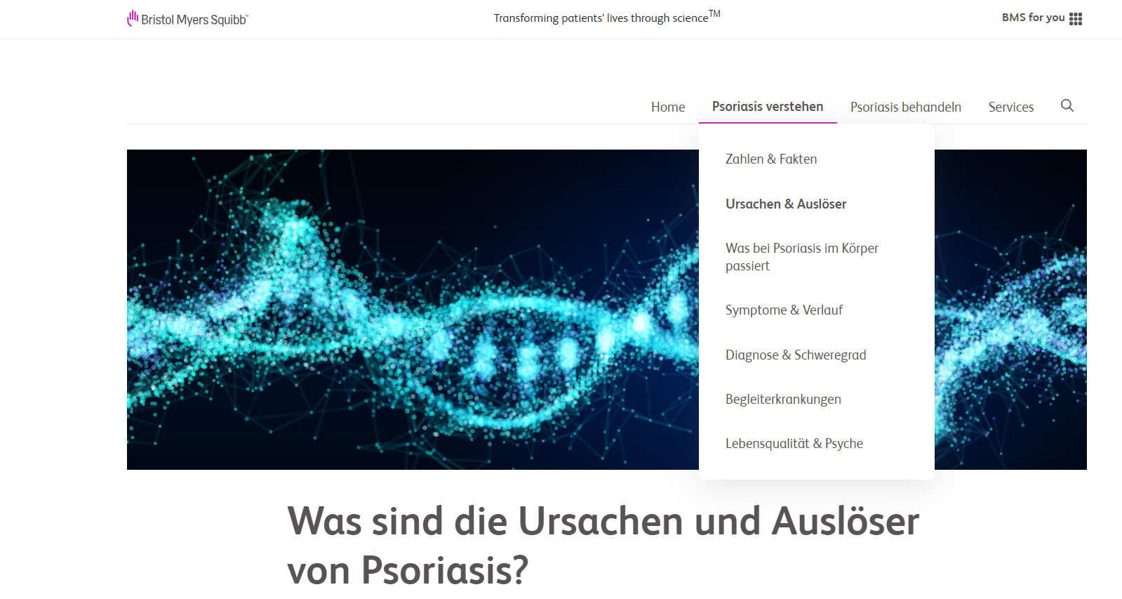
Main Navigation - Flat Dynamic
This Flat Dynamic variation is on hover functionality. Menu opens on hover.
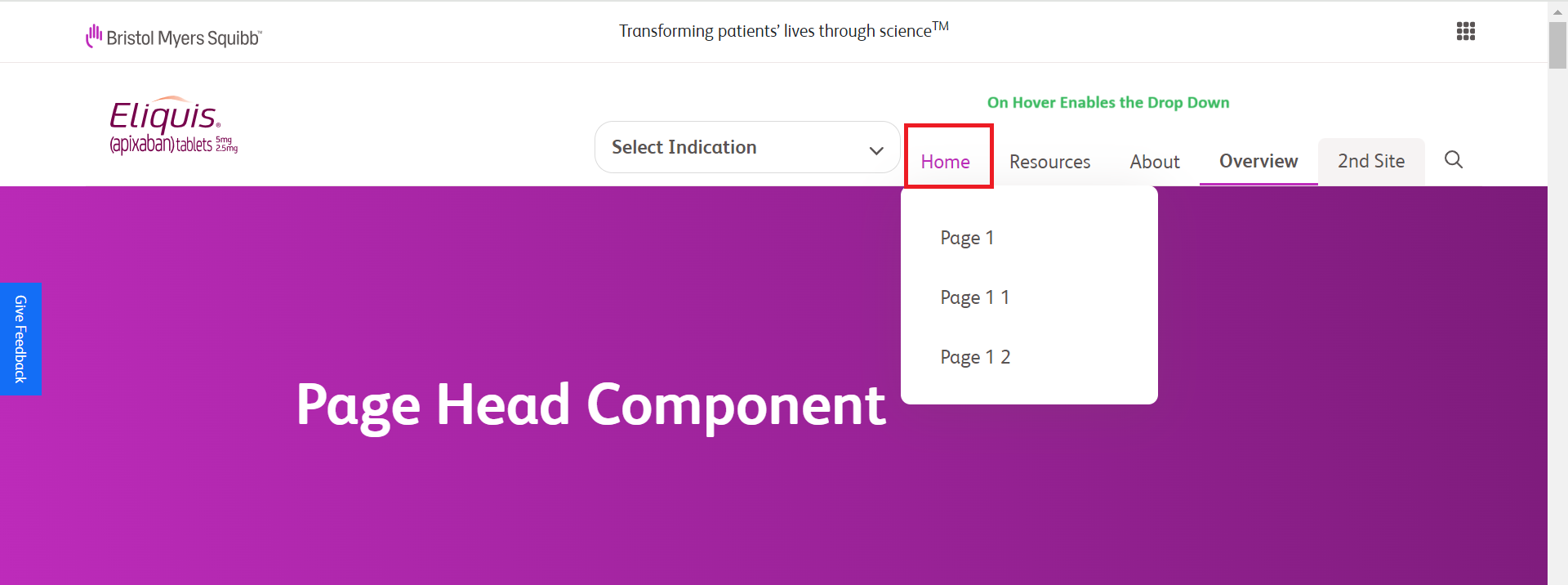
Main Navigation with Cross Link
This feature is useful when different sections of a website have different header. Eg: When the HCP & DTC sections of a website have the same domain.
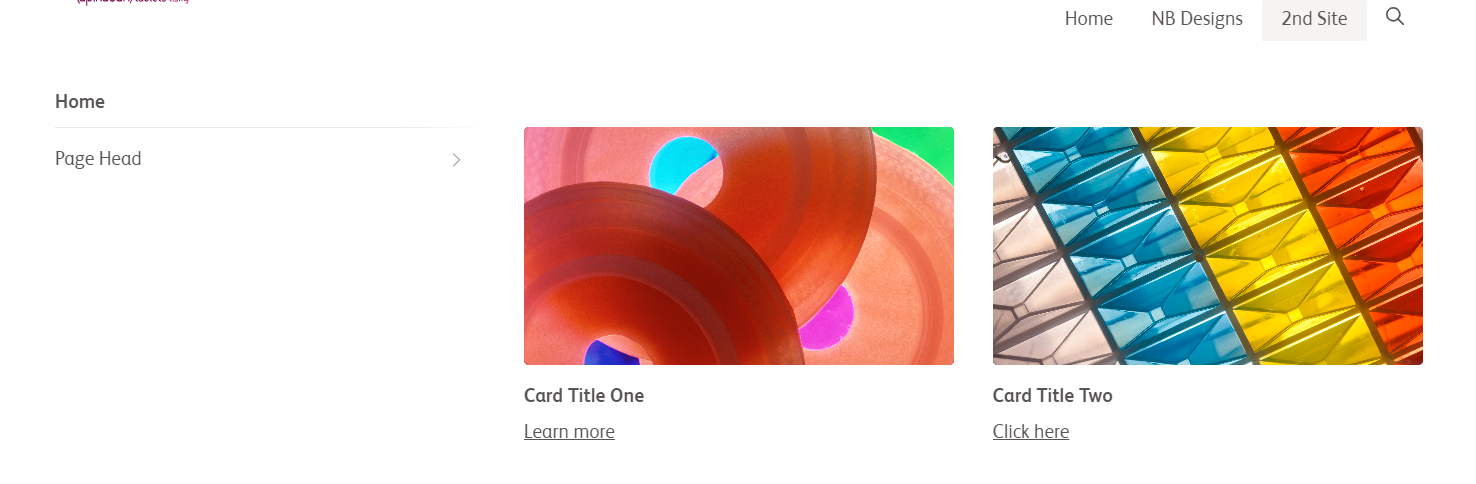
Main Navigation with Cards
User is redirected to the respective page once the card is clicked.
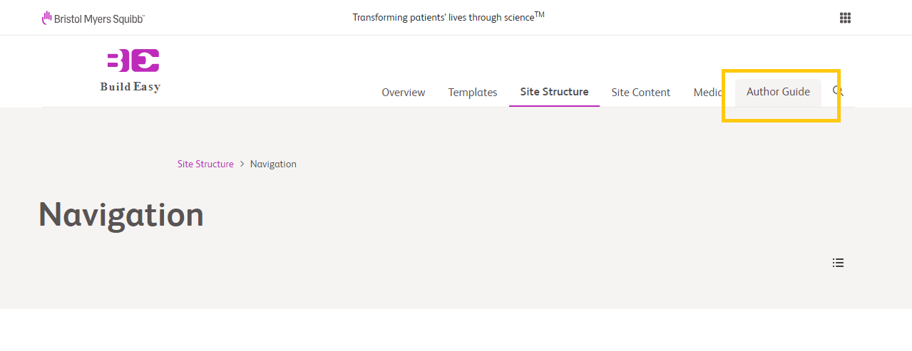
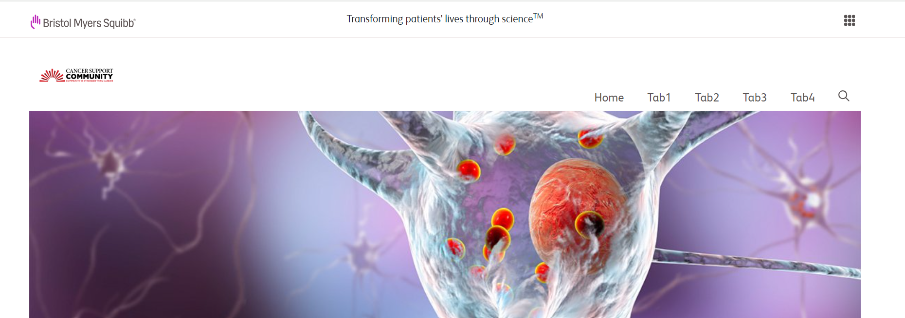
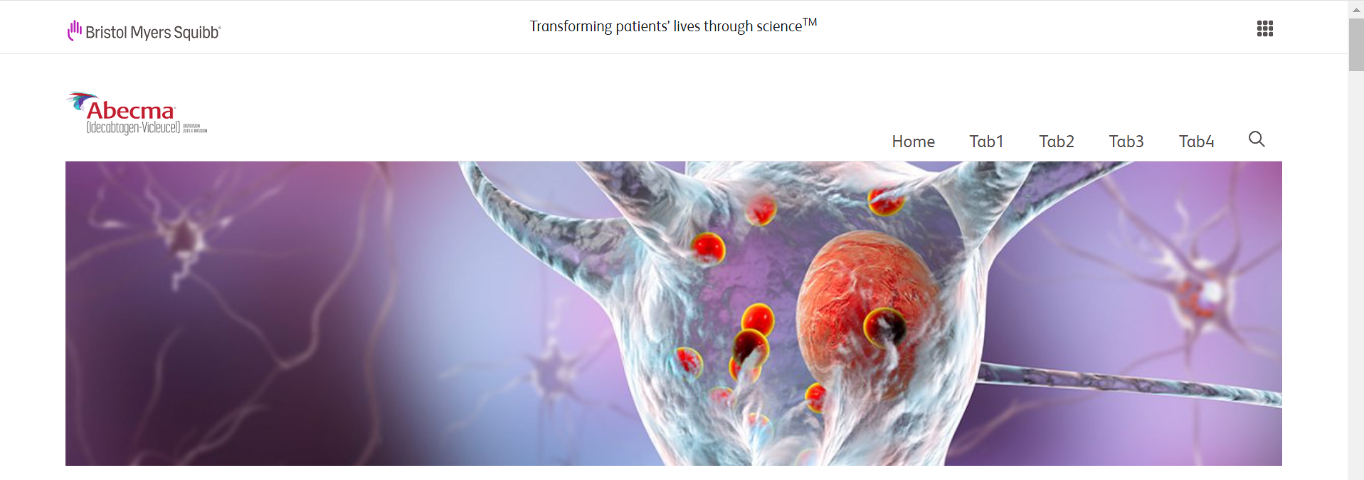
Main Navigation : Header logo & main nav specific for certain sections of the page
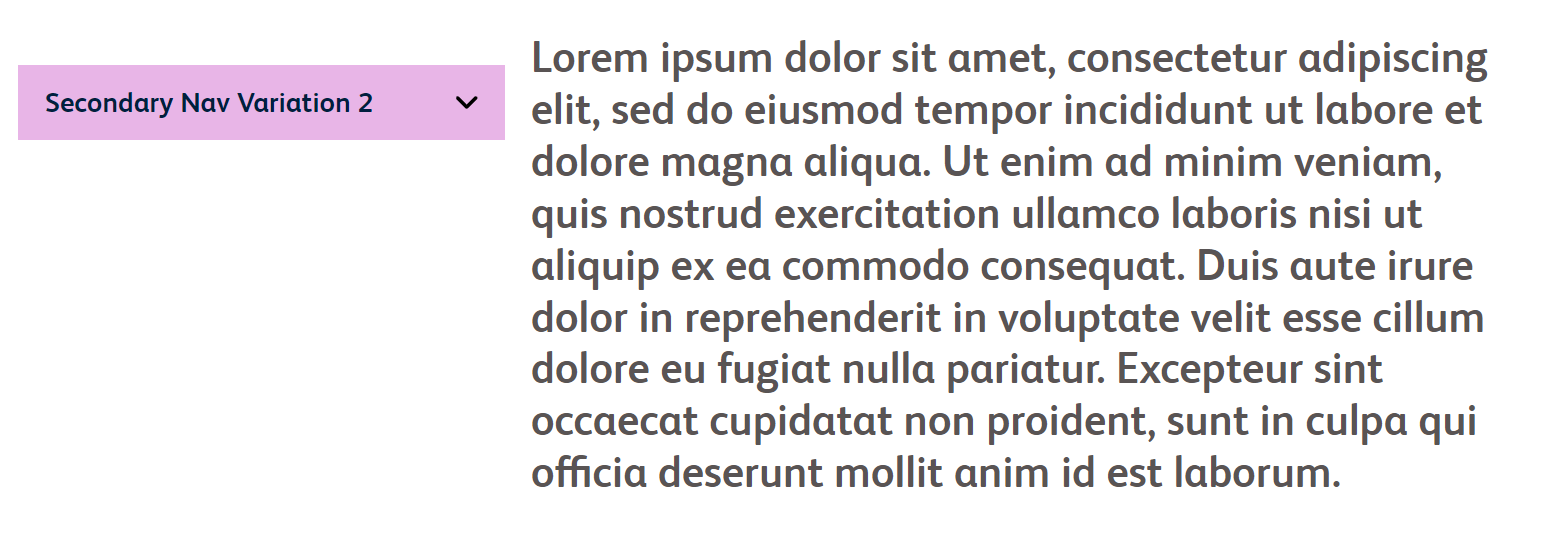
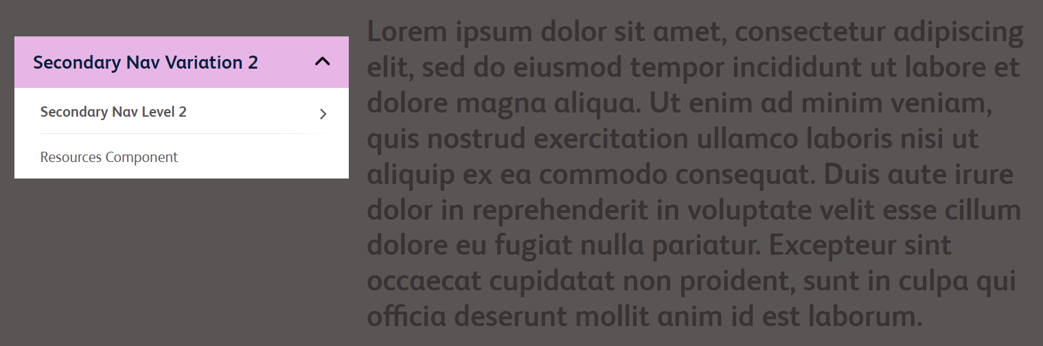
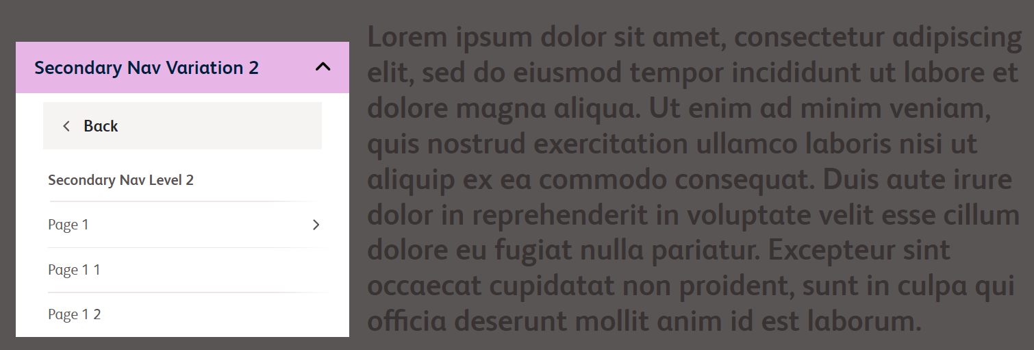
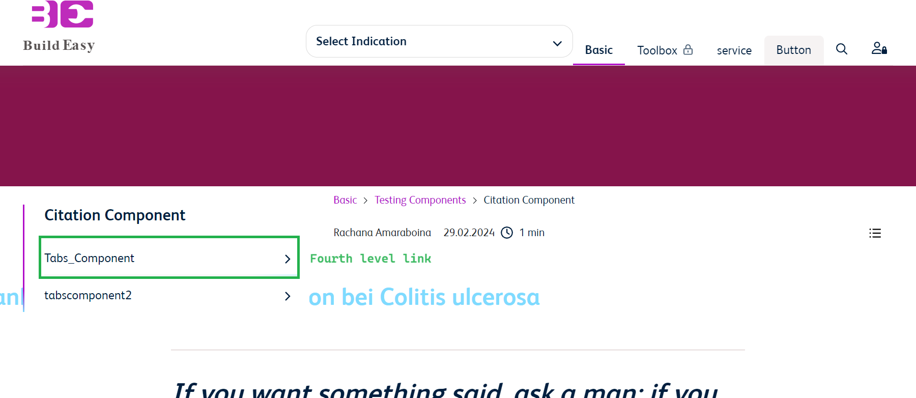
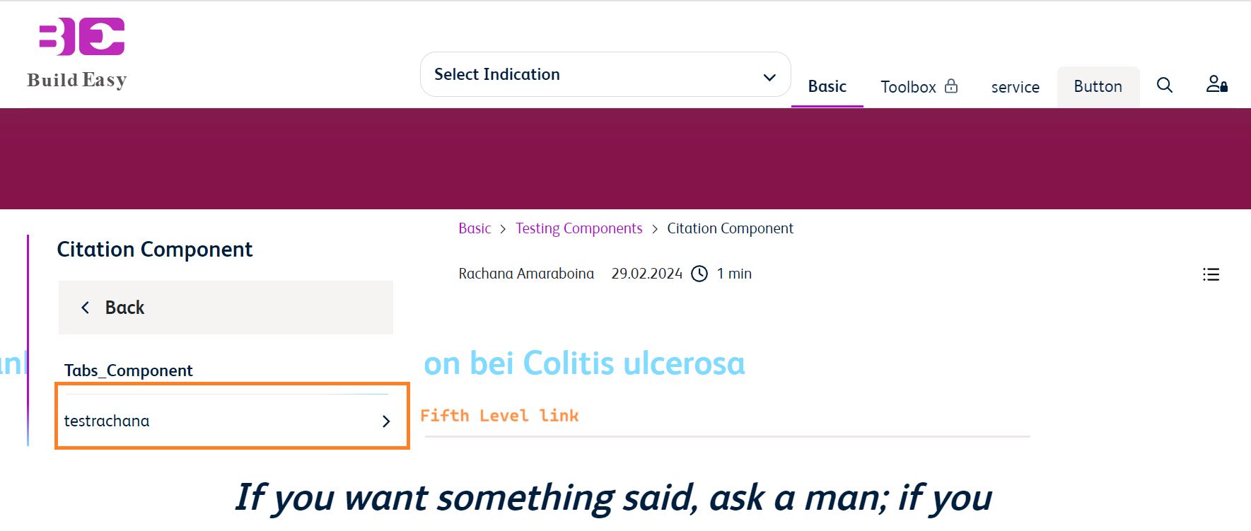
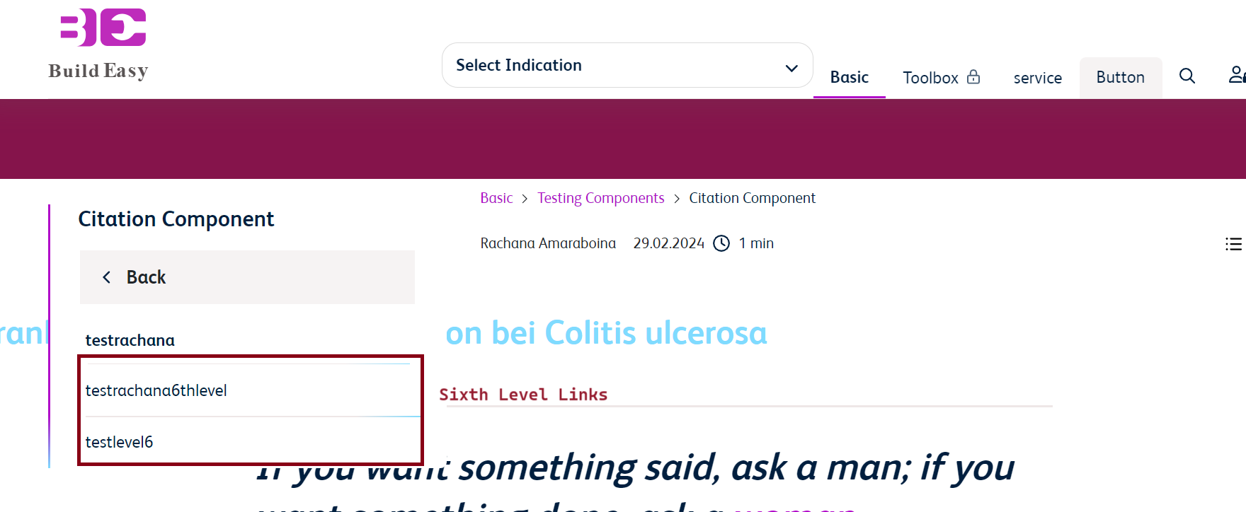
Secondary Navigation - Enable dynamic hierarchy for 4,5 and 6 the level
Allowed for "Flyout Slide Dynamic variation"
If editor check the check boxes "hierarchically Take sub pages & Take Subpages 'Child pages' " from the main Nav component we can able to create the Sub pages in the navigation and will create child pages for subpages upto 6 levels.
Additional Information
- All navigation components can be only authored by Admins.
- The size of the logo inside Main Navigation should be height - 63px and width - 250px.
- Universal Navigation:
- In the closed state - BMS logo (left aligned), Tagline (center aligned), CTA (right aligned) & the closed state of CTA text can be edited.
- On click of the menu, the navigation slides down displaying the tiles authored within it & the open state of CTA text can be edited.
- Each row in the universal navigation consits of 4 sections / columns. If the second row is not authored, the space for second row closes up.
- Univeral navigation is optional & the display can be controlled by admins via Locale Page properties.
- The copy & the links are always defaulted to white in terms of color.
- Logo within Universal Navigation (BMS logo) can be changed for collapsed and expanded states.
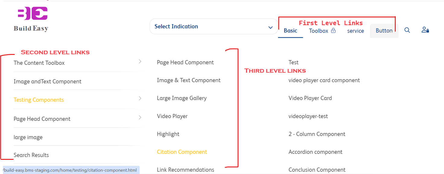
- Main Navigation, has three variations. "Flyout" variation, navitems appears until second level links & no further than that, "Flyout Slide" has the option of configuring third level links. "Flat" variation is similar to Flyout variation, but the look and feel changes, the width of the dropdown is decreased to only accomodate the 2nd level menu text and links.
- Option to configure two cards for each of First Level link. Default Build Easy card image is appended if the page doesn't have a card image.
- Text format in menu fields cannot be changed.
- Each submenu menu has an arrow is added on the right hand side of it. The arrow icon is fixed and cannot be customized.
- On hover the link color changes to primary link color.
- In the Flat variation, the active child menu link will appear to be bold.
- In Flyout and Flyout Slide variation, we can change the color of background and menu items content from Site Color Theme inside Locale Page properties.
- We get an option to add Cross Links in the Main Navigation, where we can author a complete different section with different navigation of the site within the same domain. For example: HCP / Patient
- Header logo & main navigation links can be specific for certain sections. It can be configured as part of certain section/page level via experience fragments.
- In Flat dynamic, the menu opens on hover instead of a click in desktop view. Main menu navigation links are also authorable. In mobile and tab devices view, the behaviour is same as Flyout slide.
- Secondary Navigation
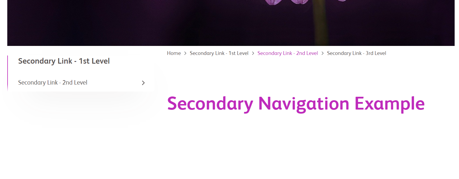
- Secondary navigation appears as a left navigation within a page if level of menu items exceeds four.
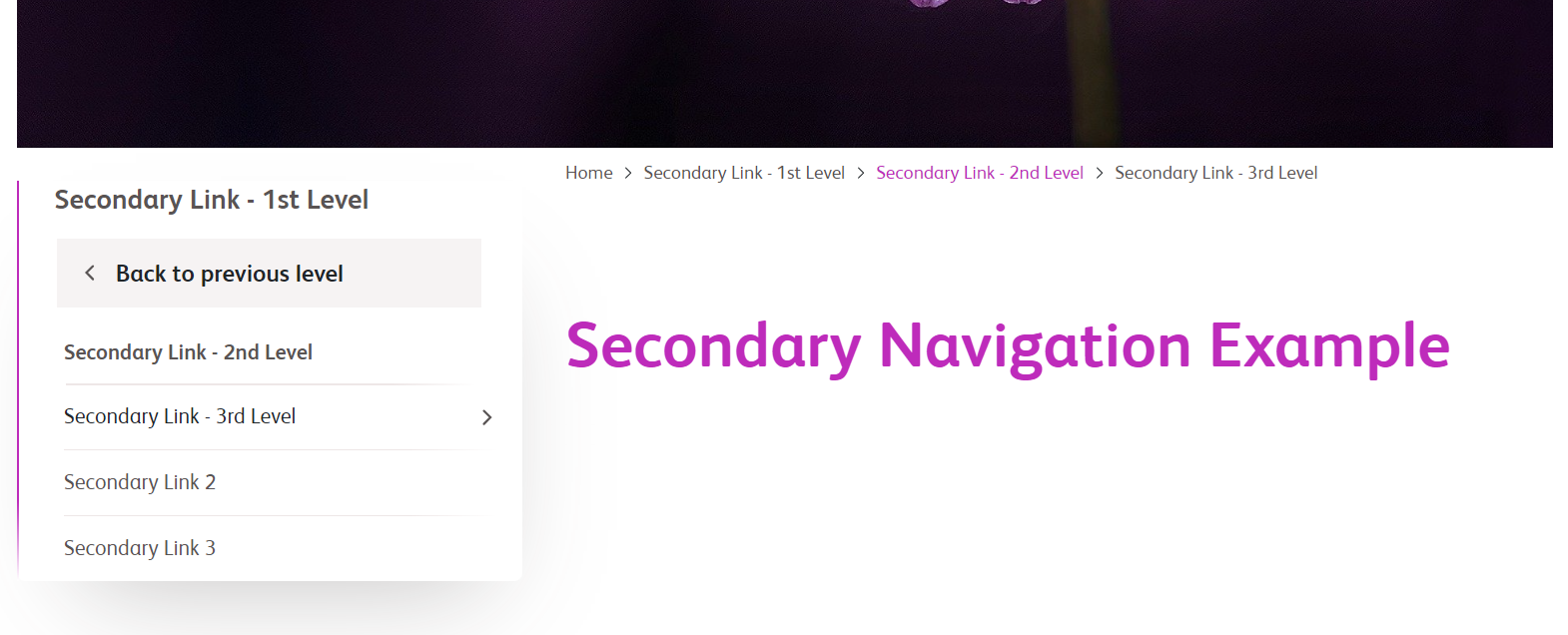
- Secondary navigation has 2 variations, where the first view is the default view. The second view has the provision to author background color & text color.
- Back button appears for a sub-section within the Secondary Navigation. Fifth level in Flyout slide variation and Fourth and Fifth in Flyout and Flat variation.
- There are no restrictions on the number links that can be included as a part of secondary navigation.
- The border appearing on the left of the menu is inherited Base - Links field and border as a separator between two link items is inhertited from the Primary - Text on Primary Background field in the Site Color Theme inside Locale Page properties. The border size and thickness are fixed and cannot be customized.
- On hover the link color changes to primary link color.
- The active page text within Secondary Navigation will be highlighted.
- Option to disable Secondary Navigation for a page from Page properties of that page and can be added anywhere within the page Responsive Column Control.
- Option to configure breadcrumbs for all the variatons based on the hierarchy, without having to manually configure the breadcrumbs.
Example: home > about > help is hierarchy
- We can also provide anchor links in main navigation. URL must be added with the anchor I'd at the end of the URL then only it will redirect to the desired page.
For more details on authoring part of these components, please visit Universal Navigation, Main Navigation and Secondary Navigation component authoring guide.
