


.png)

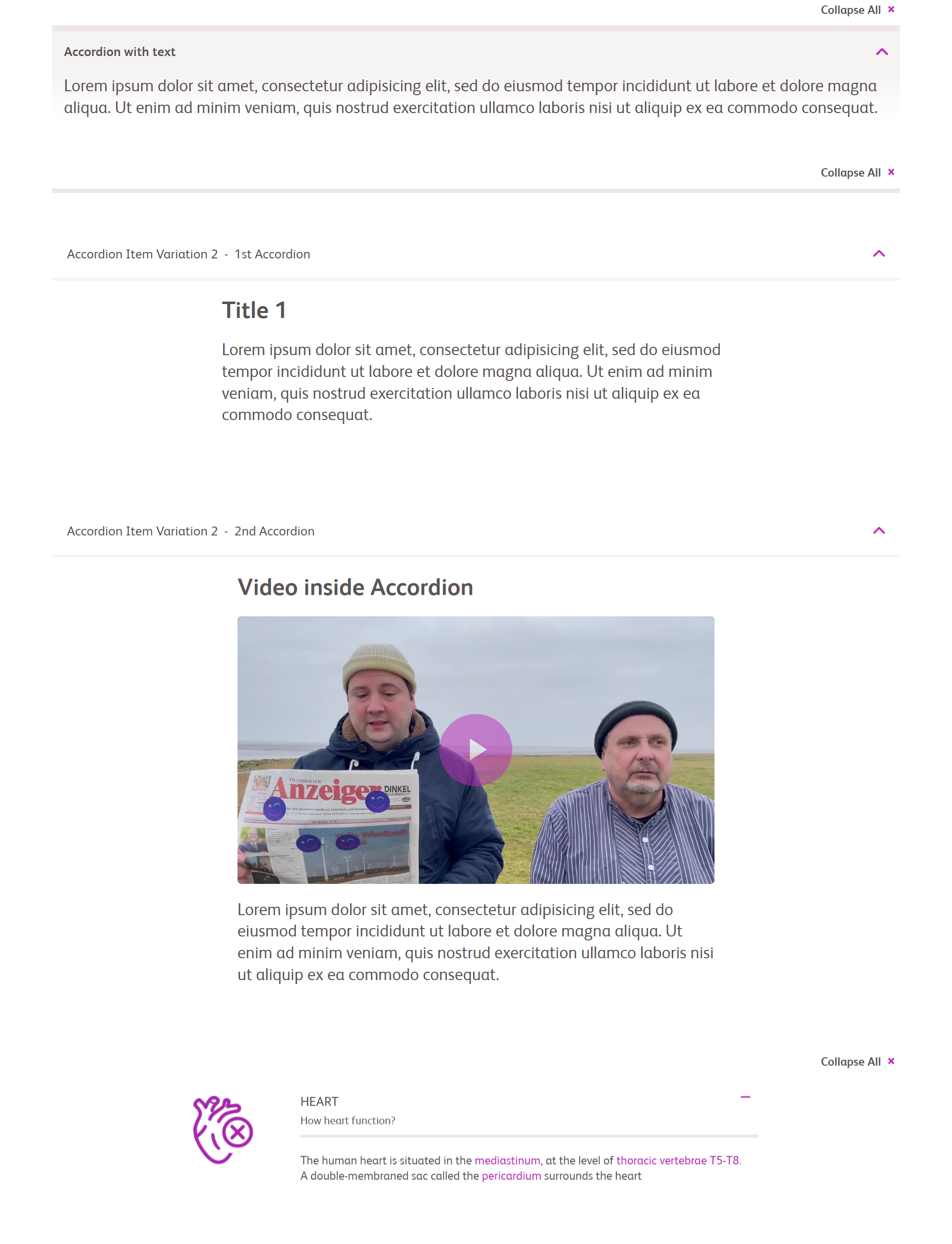
Accordion Core Component allows users to create expandable and collapsable sections in an Adaptive Form. It is often used to organize and simplify long or complex forms by breaking them up into smaller, more manageable sections.
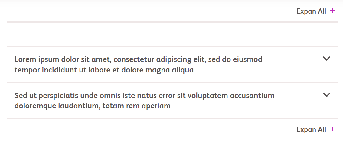
Accordion Core Component allows users to create expandable and collapsable sections in an Adaptive Form. It is often used to organize and simplify long or complex forms by breaking them up into smaller, more manageable sections.
The Image Component automatically adapts to different screen sizes and resolutions. It selects the appropriate image size based on the visitor’s device, ensuring optimal performance and visual quality.
The Cards Callout component is a versatile component used to display a set of visually appealing cards, each containing relevant information or links.
The Image Component automatically adapts to different screen sizes and resolutions. It selects the appropriate image size based on the visitor’s device, ensuring optimal performance and visual quality.
Accordion Core Component allows users to create expandable and collapsable sections in an Adaptive Form. It is often used to organize and simplify long or complex forms by breaking them up into smaller, more manageable sections.

The Background Color Container Component is used to group other components and apply a common style or layout. It provides a way to organize content and create structured sections on a page.
The Cards Callout component is a versatile component used to display a set of visually appealing cards, each containing relevant information or links.

The Call to action panel appears when the video ends and displays all interactive swatches associated with the particular video. The panel consists of a header area showing the video title, a replay button in the upper-right corner, and actual interactive swatches shown as a scrollable grid.
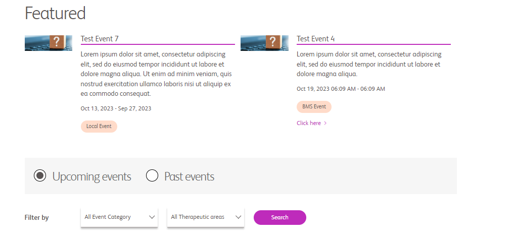
An Events component signifies a state change notification triggered by specific actions. For instance, events occur when content fragments are created, updated, or deleted.
Accordion Core Component allows users to create expandable and collapsable sections in an Adaptive Form. It is often used to organize and simplify long or complex forms by breaking them up into smaller, more manageable sections.

The Page Head component serves as the foundation for all pages created using the Core components. It allows you to assemble page header, footer, and structural components within the template editor.

The Image Component automatically adapts to different screen sizes and resolutions. It selects the appropriate image size based on the visitor’s device, ensuring optimal performance and visual quality.
Accordion Core Component allows users to create expandable and collapsable sections in an Adaptive Form. It is often used to organize and simplify long or complex forms by breaking them up into smaller, more manageable sections.
Accordion Core Component allows users to create expandable and collapsable sections in an Adaptive Form. It is often used to organize and simplify long or complex forms by breaking them up into smaller, more manageable sections.
An Anchor component is used to create jump links or hash links within a webpage. These links allow users to navigate to specific sections of the same page by clicking on anchor points.
mlo
mlo
description text goes here. description text goes here.description text goes here.description text goes here.description text goes here.description text goes here.description text goes here.
description text goes here. description text goes here.description text goes here.description text goes here.description text goes here.description text goes here.description text goes here.
Accordion Core Component allows users to create expandable and collapsable sections in an Adaptive Form. It is often used to organize and simplify long or complex forms by breaking them up into smaller, more manageable sections.
The Call to action panel appears when the video ends and displays all interactive swatches associated with the particular video. The panel consists of a header area showing the video title, a replay button in the upper-right corner, and actual interactive swatches shown as a scrollable grid.
The Page Head component serves as the foundation for all pages created using the Core components. It allows you to assemble page header, footer, and structural components within the template editor.
An Anchor component is used to create jump links or hash links within a webpage. These links allow users to navigate to specific sections of the same page by clicking on anchor points.